Layout blocks
Containers, columns and the controls that go in them. The collapse thresholds on this page belong to core — 782 pixels for columns, 600 for several others — and they are deliberately left alone, because overriding them is the usual way a working mobile layout stops working.
Two columns
The default two-column split, with enough text in each cell that the columns actually have to divide a real measure rather than a phrase.
The second cell, carrying a different amount of text so the two columns do not end level. Equal-length cells hide vertical alignment bugs completely.
Half the width, with its own background and padding. This is where a column that is not border-box overflows its own track.
A quarter.
Averylongunbrokenwordinanarrowcolumn
Four columns that refuse to stack on mobile.
At 320 pixels each of these is about sixty pixels wide.
Which is the point: it is the hardest case on the page.
It must still not scroll the page sideways.
A default group
A constrained group at the default width. Its children are laid out by core’s own is-layout-constrained, which is the one mechanism this project must not reimplement.
A wide group with a background and generous padding. Core’s own rule gives any group with a background padding: 1.25em 2.375em, applied to the same element that carries the width — the exact case the scoped border-box exists for.
A flex group,
spread across the full width,
with wrapping enabled.
Grid cell one, with a background so the track edges are visible.
Grid cell two, holding a longer run of text than its neighbours so the row height is set by content rather than by the shortest cell.
Grid cell three.
Buttons
Separators and spacing
Above: the default separator. Core draws it in currentColor at forty percent opacity, which on a palette whose hairline tint is already pale makes it disappear entirely.
A ninety-six pixel spacer sits above this paragraph. If the vertical rhythm rule is also adding a gap, the space here will be larger than the number asks for.
Accordion
Open by default. Core ships the accordion with a single box-sizing declaration and nothing else — no border, no surface, no padding on the toggle beyond what it reads from the spacing preset.
Closed. The toggle reads its horizontal padding from --wp--preset--spacing--20, and this project sets that slug to half a rem — half of core’s own fallback — so the toggle is tighter than core intends until the stylesheet says otherwise.
- A list inside a panel.
Three items, so the borders between them are visible as a set rather than as a single edge.
Tabs
The first tab panel. Tabs, like the accordion, arrive with no styling at all beyond box-sizing, so an unselected tab and a selected one look identical until the theme says otherwise.
The second.
The third, whose label is long enough to test what the tab strip does when the labels no longer fit on one line.
Deprecated and editor-only
A synced pattern
This markup lives in a wp_block post and is pulled in by reference. It renders through core/block, which has no styling of its own — whatever is inside it inherits the page it lands on, which is the thing worth checking.
Above: a synced pattern pulled in by reference through the reusable-block block. Below: the pattern block, which resolves a registered pattern slug at render time and replaces itself with that pattern’s blocks.
-
ESP32-S3-CAM N16R8: the Camera Board the ESP32-CAM Should Have Been
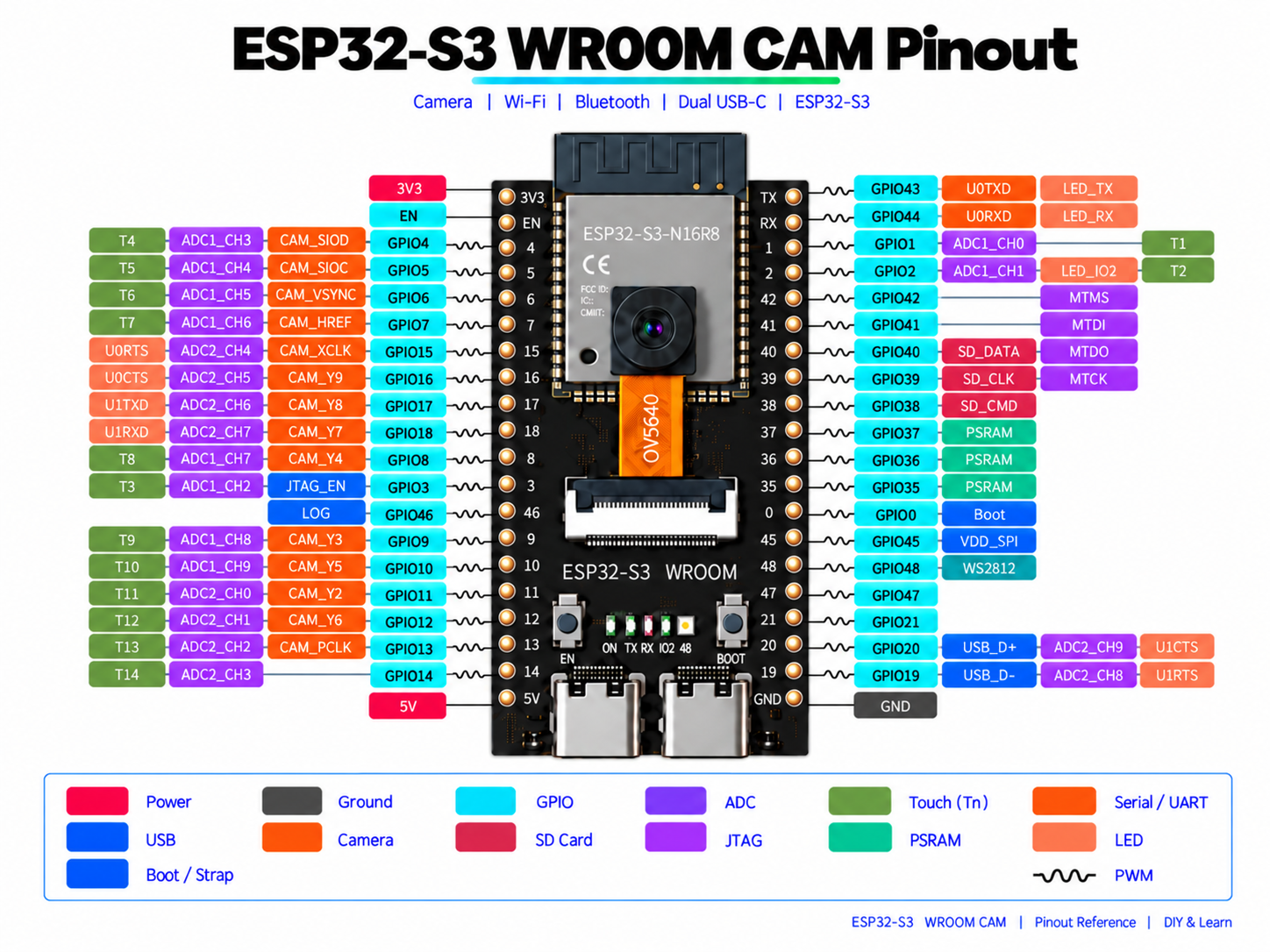
An ESP32-S3 board with a 5 MP OV5640 camera, two USB-C ports, microSD, 16 MB of flash and 8 MB of PSRAM. What is wired to what, which of its 36 GPIOs are really free, how to set up Arduino so the camera behaves, and a pin reference to download.
-
LILYGO TTGO T-Display: the ESP32 That Shows the Result Right Away
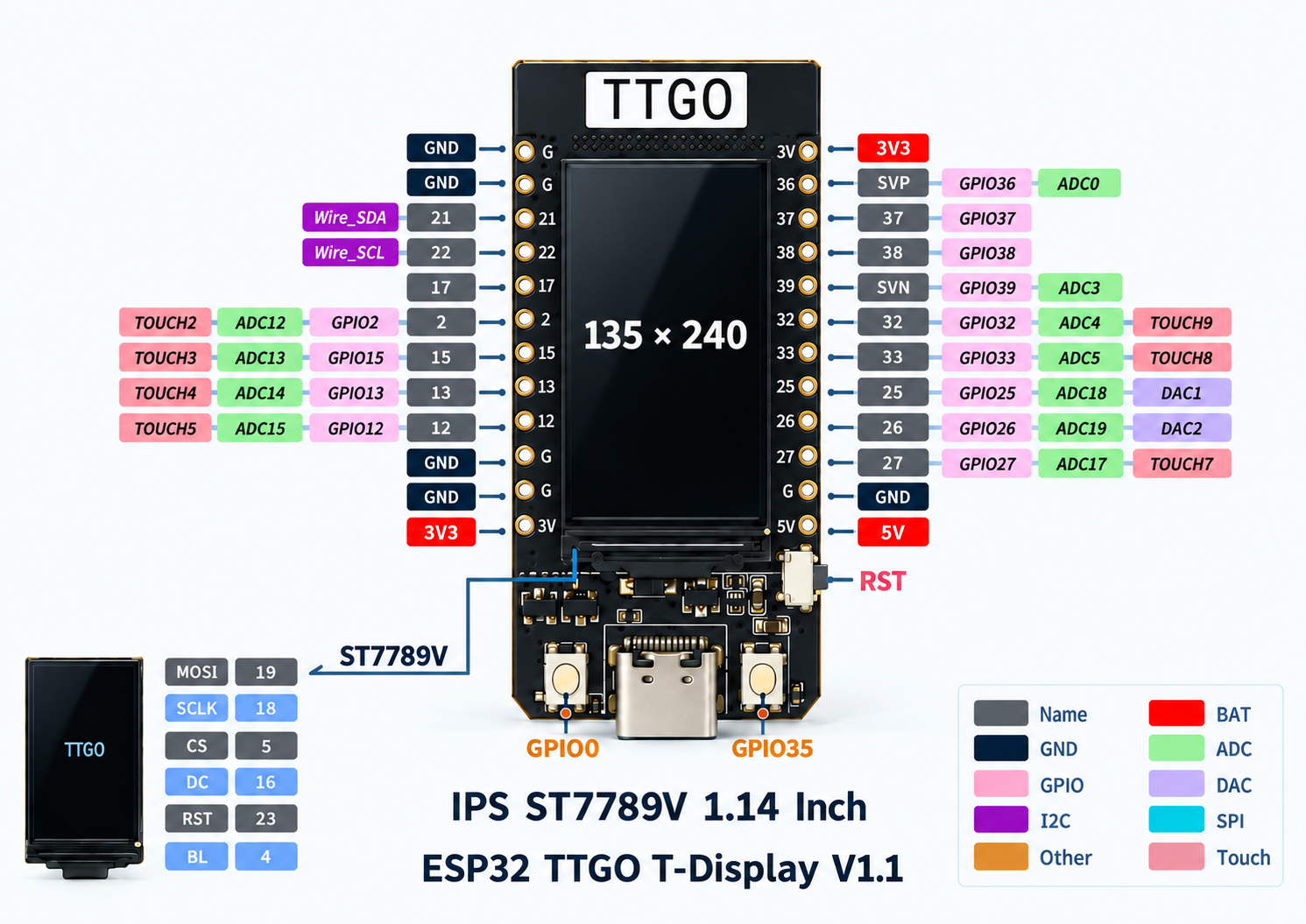
An ESP32 board with a 1.14-inch colour screen already wired to it. What is connected where, which GPIOs are safe to use, how long it lasts on a battery — and where the classic T-Display ends and the S3 begins.


The deprecated text-columns block, still registered and still insertable, so still in scope.
It predates the columns block and lays itself out with its own CSS.
Three cells, each with enough text to wrap.
Above this paragraph is the navigation overlay close button, placed outside an overlay where it has nothing to close. It renders inertly, which is expected — it is on the page so that it is measured rather than assumed.
And after the more tag, which on a page renders as nothing at all.